Implementing React-like Composition using Go's html/template
React popularized component based frontend development and newer frameworks like Flutter, SwiftUI etc have followed the same model. I feel this model provides really good ergonomics and it’s hard to go back to the older ways of building frontends.
The problem with React is that it comes with the modern JS baggage - everything feels unnecessarily complex and bloated, and I say that as someone who has worked with JS and frontend for the past 15 years!
It’s no wonder I feel drawn to Go with its “batteries-included” design and no-BS philosophy.
But is it possible to get React like ergonomics in Go? Can we have our cake and eat it too? The answer is yes, and we can achieve all this using just the standard library.
If you’re too excited to see how it looks like, here’s a demo app built using this approach.

Framing the problem
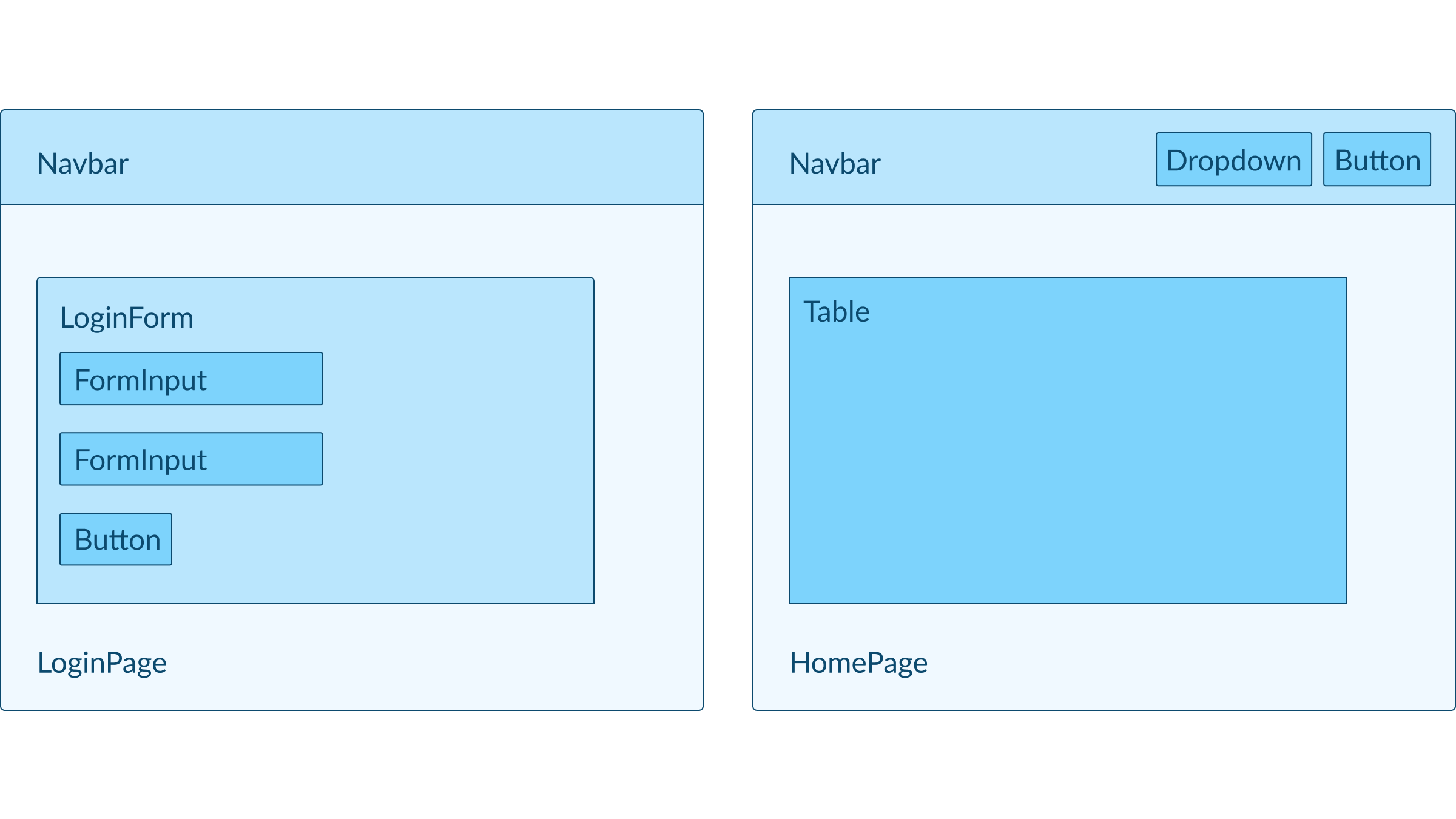
We want to be able to split the UI into smaller components like Button, Dropdown, FormInput etc, then we compose them into bigger components like Navbar, LoginForm, NewUserForm etc, and then compose them further into even bigger page-level components like HomePage, LoginPage, and so on.
At the same time, we want these components to be reusable across the codebase, be configurable so they can have different variants and have the higher level components abstract away the lower details.
Let’s use an example, here’s how we want the frontend to look like visually:

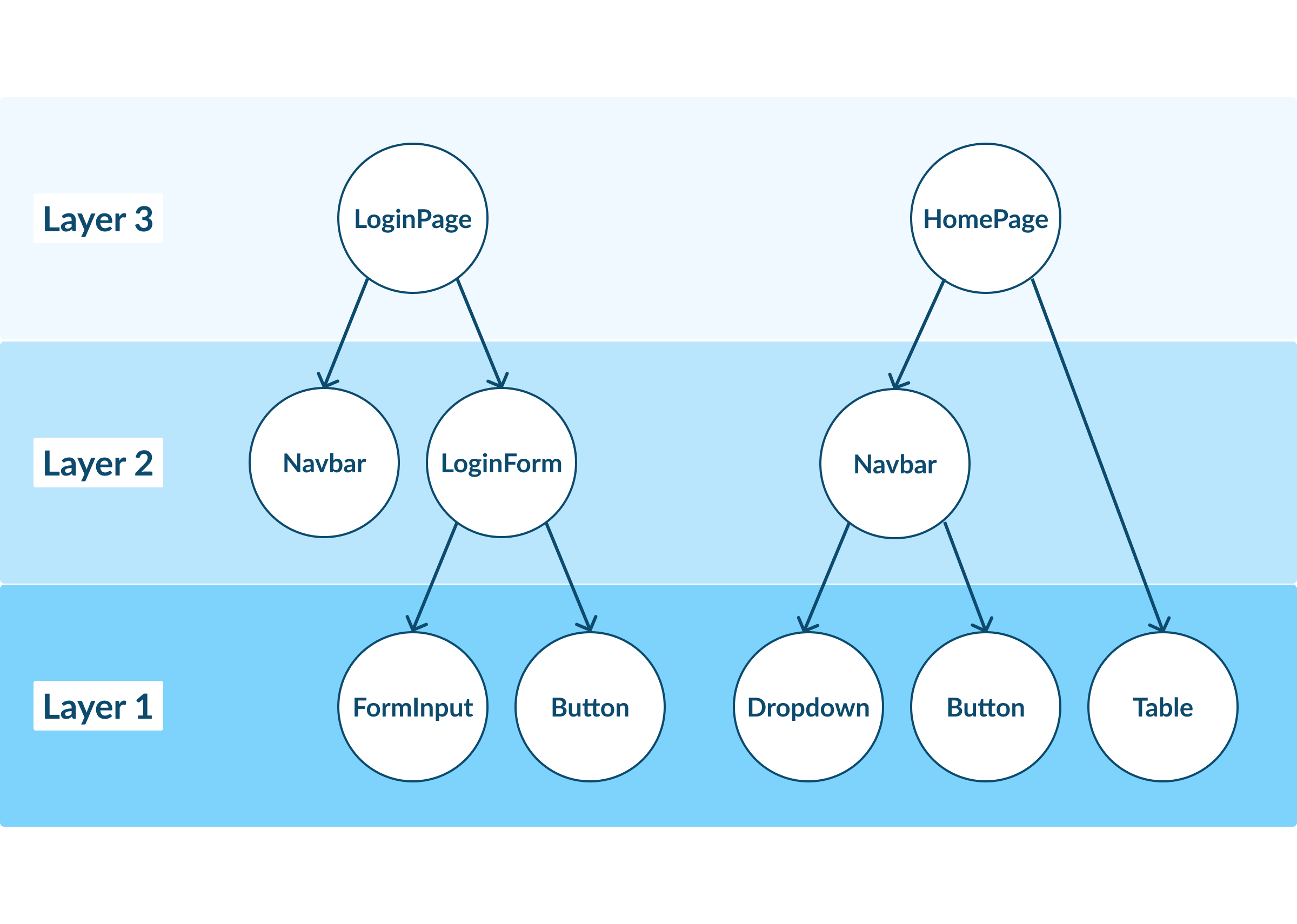
How the component tree would look like:

We can see that the two pages share most of the components with some variations. Components like Navbar should be able to abstract away its child components.
Implementation using html/template
Lets define a low-level component, Button:
// components/button.html
{{define "button"}}
    <button class="button-container">
        <a
            class="button {{if .IsPrimary}}primary{{end}}"
            {{if eq .IsSubmit true}}
                type="submit"
            {{else}}
                href="{{.Link}}"
            {{end}}>
            {{.Text}}
        </a>
    </button>
{{end}}
// components/button.go
package components
type Button struct {
Text string
Link string
IsSubmit bool
IsPrimary bool
}Let’s define the Navbar:
// components/navbar.html
{{define "navbar"}}
<div class="navbar">
    <a class="logo" href="/">My App</a>

    <div class="actions">
        {{template "dropdown" .ProjectsDropdown}}
        {{template "button" .SettingsButton}}
    </div>

</div>
{{end}}
// components/navbar.go
package components
type Navbar struct {
ProjectsDropdown Dropdown
SettingsButton Button
}As you can see, we’ve used define to define the components and template to compose smaller components within larger ones.
Here’s how we would use the above inside LoginPage:
// features/login/login.html
<!DOCTYPE html>
<html lang="en">
    {{template "head"}}

    <body>
        {{template "navbar" .Navbar}}

        <div class="section">
            <div class="title">Login</div>
            <form action="/login" method="post">
                {{template "input" .EmailInput}}
                {{template "input" .PasswordInput}}
                {{template "button" .SubmitButton}}
            </form>
        </div>
    </body>

</html>
// features/login/login.go
// ...
func renderLoginForm(w http.ResponseWriter, email string, emailError string, passwordError string) {
type templateData struct {
Navbar components.Navbar
EmailInput components.Input
PasswordInput components.Input
SubmitButton components.Button
}
tmplData := templateData{
Navbar: components.Navbar{
SettingsButton: components.Button{
Text: "Settings",
Link: "/settings",
IsSubmit: false,
},
ProjectsDropdown: // ...
},
EmailInput: components.Input{
ID: "email",
Label: "Email",
Type: "email",
Placeholder: "Enter your email address",
Error: emailError,
Value: email,
},
PasswordInput: components.Input{
ID: "password",
Label: "Password",
Type: "password",
Placeholder: "Enter your password",
Error: passwordError,
},
SubmitButton: components.Button{
Text: "Login",
IsSubmit: true,
IsPrimary: true,
},
}
templates.Render(w, "login.html", tmplData)
}
// ...
Ignore the templates.Render part for the time being, I’ll explain it later.
You can see that we prep the data needed for rendering as a nested struct tmplData and then pass it to the template. The template which is already composed of multiple components splits tmplData and passes them to the relevant components.
If you’ve worked with React before, you can start seeing similarities in the way things are organized.
Notice how each page is also the root component, so we’ve multiple roots. I initially used the “template slots” pattern where there’s a single root template and others like MainContent, Navbar, Sidebar etc can “slot” into the placeholders, but I found it confusing and hard to reason about. The drawback with multiple roots approach is you end up repeating the DOCTYPE, html, and body tags, but I feel it’s managable. YMMV.
Abstracting away details
We can repeat the same across multiple pages, but if we look at the UI design mockups above, the Navbar component should show the Button and Dropdown only in certain pages. And even in the pages where they’re shown, we don’t want to keep repeating this piece of code:
// features/login/login.go

// ...

    tmplData := templateData{
        Navbar: components.Navbar{
            SettingsButton: components.Button{
                Text:     "Settings",
                Link:     "/settings",
                IsSubmit: false,
            },
            ProjectsDropdown: // ...
        },

// ...
This code and whether to show/hide the Button and Dropdown is better abstracted away. We can do this by creating a constructor that takes in an arg to toggle the Navbar behavior:
 // components/navbar.go
 package components

 type Navbar struct {
+   ShouldShowActions bool
    ProjectsDropdown  Dropdown
    SettingsButton    Button
 }

+func NewNavbar(ShouldShowActions bool) Navbar {
+    return Navbar{
+        ShouldShowActions: ShouldShowActions,
+        SettingsButton:    Button{Text: "Settings", Icon: "gear", Link: "/settings", IsSubmit: false},
+    }
+}
// components/navbar.html
{{define "navbar"}}
<div class="navbar">
<a class="logo" href="/">My App</a>
+ {{if .ShouldShowActions}}
<div class="actions">
{{template "dropdown" .ProjectsDropdown}}
{{template "button" .SettingsButton}}
</div>
+ {{end}}
</div>
{{end}}We can now update LoginPage:
 // features/login/login.go

 // ...

     tmplData := templateData{
-        Navbar: components.Navbar{
-            SettingsButton: components.Button{
-                Text:     "Settings",
-                Link:     "/settings",
-                IsSubmit: false,
-            },
-            ProjectsDropdown: // ...
-        },
+        Navbar: components.NewNavbar(false),

 // ...
State management
So far, we’ve seen how to compose components and pass data from one layer to the ones below. This is sufficient for simple applications, but if you’re building something like a dashboard, then we require state management.
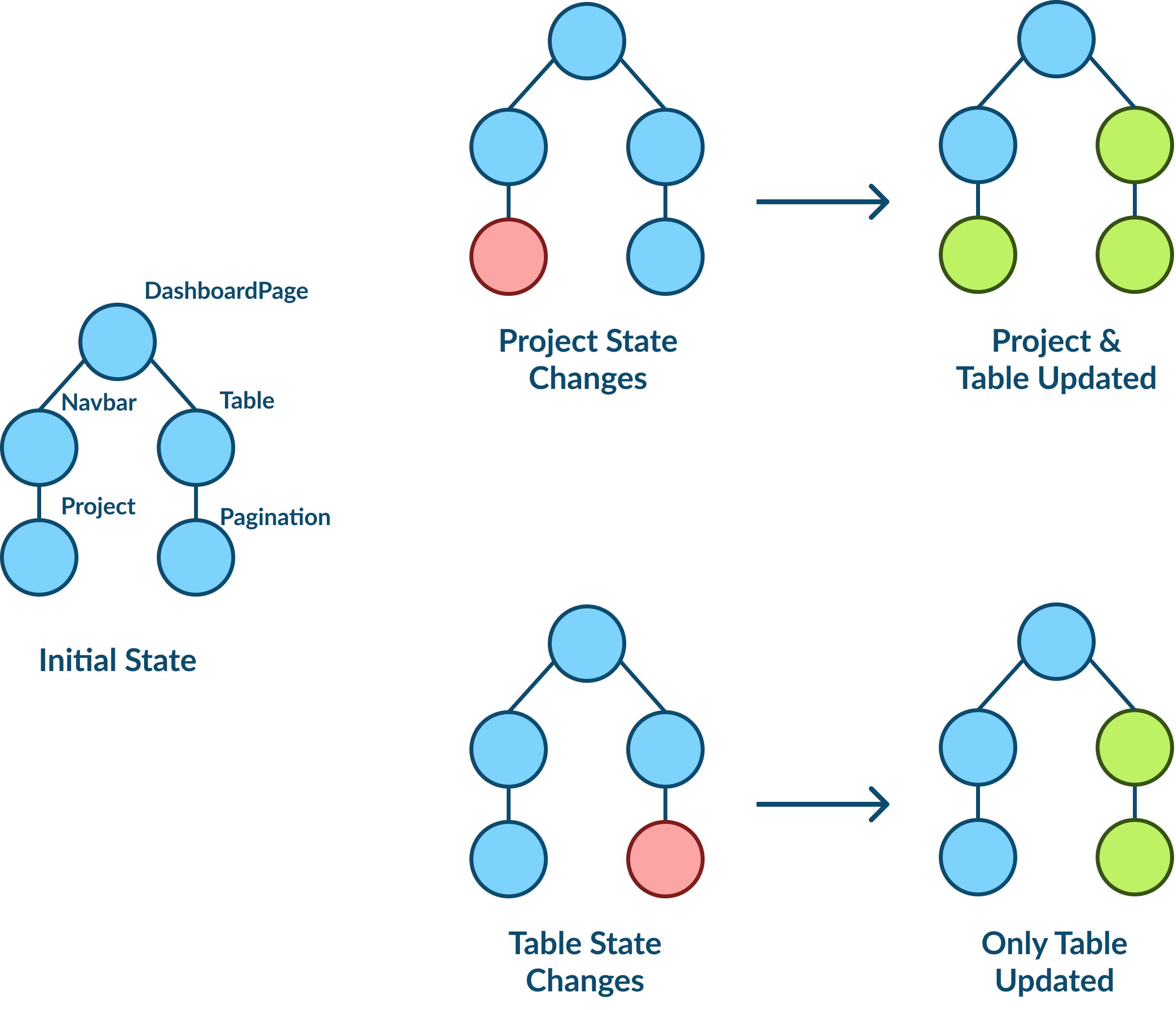
Let’s say your dashboard has a project selector and a table with pagination, we would have these requirements:
- If no project is selected, we need to set default values
- If the user clicks to see the next set of rows in a table, the project selector should not change
- If project is changed, the table state should be reset

Basically interacting with some components should only affect itself, whereas interacting with others can affect multiple components.
We can use the OG solution for state management - URL query params. Here’s how the logic would look like:
// ...

func HandleDashboardPage(w http.ResponseWriter, r *http.Request) {
    selectedProjectID := r.URL.Query().Get("project_id")
    tableOffset := r.URL.Query().Get("table_offset")

    // Set to default values
    if state.selectedProjectID == "" {
        newURL := fmt.Sprintf("/dashboard?project_id=%s&table_offset=%d", projects[0].ProjectID, 0)
        http.Redirect(w, r, newURL, http.StatusSeeOther)
        return
    }

    renderDashboardPage(w, selectedProjectID, tableOffset)
}

// ...
We parse the query params to see if the state is already set, otherwise we initialize it to default values. We then construct the links inside the table pagination to point to the new state.
// ...


func renderDashboardPage(w http.ResponseWriter, projectID string, tableOffset string) {
    type templateData struct {
        Navbar components.Navbar
        Table  components.Table
    }

    navbar := getNavbar(projectID)
    table := getTable(projectID, tableOffset)

    tmplData := templateData{
        Navbar: navbar,
        Table:  table,
    }

    templates.Render(w, "dashboard.html", tmplData)
}

func getTable(projectID string, offset string) components.Table {
    var records []Record
    limit := 10

    offset, err := strconv.Atoi(offset)
    if err != nil {
        offset = 0
    }

    table := components.Table{
        Records:              records,
        ShouldShowPagination: false,
        Pagination: components.Pagination{
            PageStartRecord: offset + 1,
            PageEndRecord:   0,
            TotalRecords:    0,
            PrevLink:        "",
            NextLink:        "",
        },
    }

    records := GetPaginatedRecords(projectID, limit, offset)

    if len(records) > 0 {
        table.Records = records
        table.Pagination.TotalRecords = records[0].TotalRecords
        table.Pagination.PageStartRecord = offset + 1
        table.Pagination.PageEndRecord = offset + len(records)
        table.ShouldShowPagination = records[0].TotalRecords > limit
    }

    // This would keep the projectID as constant and only change the table state
    if table.ShouldShowPagination && offset != 0 {
        table.Pagination.PrevLink = fmt.Sprintf("/dashboard?project_id=%s&table_offset=%d", projectID, offset-limit)
    }

    if table.ShouldShowPagination && offset+limit < table.Pagination.TotalRecords {
        table.Pagination.NextLink = fmt.Sprintf("/dashboard?project_id=%s&table_offset=%d", projectID, offset+limit)
    }

    return table
}

// ...
There’s probably a more elegant way to do this, but this approach is sufficient for my current use case.
File organization
I wanted to colocate my templates with their logic instead of dumping them all into a single /templates folder:
.
|-- assets
|   `-- index.css
|-- commons
|   |-- components
|   |   |-- button.go
|   |   |-- button.html
|   |   |-- input.go
|   |   |-- input.html
|   |   |-- navbar.go
|   |   `-- navbar.html
|   `-- templates
|       `-- templates.go
|-- features
|   |-- home
|   |   |-- home.go
|   |   `-- home.html
|   |-- login
|   |   |-- login.go
|   |   `-- login.html
|   `-- users
|       |-- user_detail.html
|       `-- users.go
|-- go.mod
|-- go.sum
`-- main.go
I also wanted to embed all these templates and css into a single Go binary.
Here’s how I implemented this:
// main.go

package main

import (
    "embed"
    "myapp/commons/templates"
)

//go:embed all:commons all:features
var resources embed.FS

//go:embed assets/*.css
var assets embed.FS

func main() {
    // ..
    templates.NewTemplates(resources)
    // ..
}
// commons/templates/templates.go
package templates
import (
"bytes"
"embed"
"fmt"
"html/template"
"io/fs"
"net/http"
"strings"
)
var tmpl *template.Template = nil
func NewTemplates(resources embed.FS) {
var paths []string
fs.WalkDir(resources, ".", func(path string, d fs.DirEntry, err error) error {
if strings.Contains(d.Name(), ".html") {
paths = append(paths, path)
}
return nil
})
tmpl = template.Must(template.ParseFS(resources, paths...))
}
func Render(w http.ResponseWriter, name string, data interface{}) {
var buffer bytes.Buffer
err := tmpl.ExecuteTemplate(&buffer, name, data)
if err != nil {
err = fmt.Errorf("error executing template: %w", err)
http.Error(w, err.Error(), http.StatusInternalServerError)
return
}
w.Header().Set("Content-Type", "text/html; charset=UTF-8")
buffer.WriteTo(w)
}The NewTemplates function walks through all the template (*.html) files inside the project and parses them. We also see the Render function from earlier which renders the template and handles the errors.
Conclusion
That’s it! I feel this setup should be sufficient for small to medium-sized frontend codebases.
You can see a full implementation here or look at the demo app built using this approach.